Friday, September 21, 2012

Designer Statement

I Am A Designer

Most people, growing up change their minds several times on what they intend to be when they grow up. I have dedicated my life to designing artworks and was always told that it would get me nowhere; that it is just a waste of paper. Proving those around me that they were wrong; I have what it takes artistically to create some of the most magnificent works of art to show the world. Though life experiences put my design life on hold, I have continued to stay with the times and learned new methods of creating art. Now, I am back to show the world that I am a designer that will solve any and all problems by never accepting defeat, and will most definitely never quit. I am now and always will be a Designer.

Thursday, September 20, 2012

Venom Company Project

Greetings viewers,

My name is Mat Lasky and I am the owner and the designer at Venom Graphics. Look up Venom Graphics at my website to view portfolio. Click www.venomgraphicarts.wix.com/main to learn more about the Venomous Graphics Services.

Background

I enjoy my passion for art and want to show others how to enjoy art as well. In this blog, Venom has discussed the elements of design and will continue to post on different techniques and tools in design to show those whom are interested but don't know where to begin. I will post interesting art tools, techniques and even examples of Arts to help those that wish to learn. Keep informed of my posts, new additions to my portfolio, and services that Venom provides. Follow us on facebook.com, blogger.com and at www.venomgraphicarts.wix.com/main . Feel free to recommend your friends, co-workers, and anyone who is interested in art or needs one of our services.

Project Venom

Venom Graphics began as a project for a Design Fundamentals course while attending The Art Institute of Austin. We will be discussing the design process from starting a design company from the ground up just as Venom did.


Design Process for Building Venom

Idea Process / Planning the company's complete neccessities was a long tedious process. Questions to answer were : What should the company's name be? What logo best represents the company's beliefs, work ethic, and the name?(needed to be a strong image and name). What does a business need to advertise themselves? These questions started the process on its way. Ideas were flowing faster than could be written down. Below are notes that were taken in the process of designing the company.


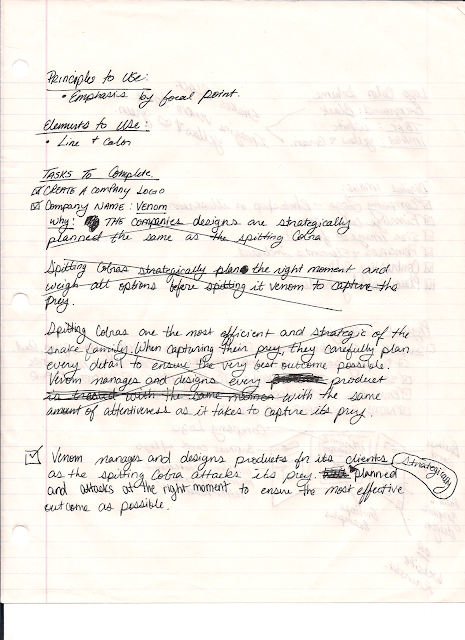
Venom was decided as a STRONG concept for Venom Graphics. It was inspired by the concepts of the Spitting Cobra and how it attacks its prey. The spitting Cobra patiently observes its prey; analyzing all concepts of capturing its prey. They silently recon the prey planning every route, create a plan for attack, and silently move in close enough to engulf its prey with its venom to capture its prey before they can react. Venom graphics concept is quite similar. Here we carefully and diligently plan the designs for our clients by weighing all ideas and planning for the best outcome. All concepts are like the venom, where all concepts are kept silent from competition companies and are designed to catch the competition off guard which places each company far above the competitors. With this concept we strive to not only meet, but, far exceed any expectations of our clients.


Above are the beginning phases of starting a company. The fundamentals of finding a name, an image, company beliefs, and background.


Logo images to include color scheme was quite simple. Deciding that the company name was venom, sticking with the idea of what colors venom were typically which is yellow, and green. Using a common snake color which is black was the most effective way to contrast the logo. Then it was decided, Black, green, and yellow were the hues that would be used to represent Venom.

A few sketches were created on notebook paper (which you will see toward the end of this post). Good ideas are always obvious, however, great ideas are transparent and tend to hit you at the most inopportune times. So a designer must be ready at any time to capture the idea on paper. The best idea hit while eating dinner so it was necessary to quickly sketch the concept on a napkin. Behold, turned out to be the concept to go with.

The Plan to organize all ideas as would be achieved for a client, all concepts were designed accordingly and placed onto a display board to view the overall image. The planning is captured in the notes.


Above notes consist of the logistics of the company belief. The mission statement was created to ensure that the client’s needs are always placed above our concepts. All concepts will fit the desires of their company. Also, discusses services and willingness to work for any client foreign or domestic.

Company letter head is important for memos, and headers for sites. In creating the mission statement in a memorandum format, a letter head was created based off of the company logo and concepts thereof.


These are some plans of action on business cards, shipping lables, headers, and layout of website.


Above is the timeline that was projected for completion of the project. Being that this was a projection, some days took longer than expected, and other days took less. The timeline was still achieved and products outcome was magnificent. Below are the company logo image concepts that were carefully considered.


After carefully examining each idea at the simplest level they are at, the last option seemed to be most professionally driven.


The finally product for company logo was created in Adobe Photo Shop to create a professional finished product.


Process of Creating Display

Below are the steps and photographs to show the process of creating a craft display.


Use of grid is a handy tool for graphic designers to scale an image when converting from one medium to another. Scaling needed to be done to create a larger scale display image of the company logo. This process included grid, taking foam and sketching image proportionately, cutting out foam with a precision xacto knife, and use of rubber cement to attached to display board.


After creating the main background image, it now begins the process of overlapping text over the image. Thus, creating a final display board product.


Final Display Board


Monday, September 10, 2012

Rythmn


Rhythm is a system of repetitious themes and objects that is consistent with the artist's norms when creating his/her works of art.


Rhythm. Photoshop. Mat Lasky


Supremation


Malevitch, Kasimir. Suprematism. http://www.ebay.com/itm/KASIMIR-MALEVITCH-MAGNETIC-SUPREMATISM-PRINT-CANVAS-/180657955919


Suprematism was a movement in Russian Art in the early 20th century that emphasized non objective art. Placement of geometric shapes and lines to give the visual appearance of sounds and movement.


Vibrating Colors


Sarcone, Gianni. Greeting Card. http://www.giannisarcone.com/ecards.html


Majority of the time vibrating colors are meant as an optical illusion. Vibrating colors is a tool that artist’s use to create a movement within art to give an illusion of movement by using two colors that makes the eye move around the image quickly almost vibrating the eye.


Legato


Hauser, Sarah. Vist Loudoun Va. http://www.visitloudoun.org. Vist Loudoun Tourism. 2005


Legato is a method that artist use to create a flowing rhythmic pattern across the image.

Friday, September 7, 2012

Proportion


Proportion is the comparing of an object to another object that mentally a viewer already knows the size of. As we know how big a baseball is so it is easy to assume most oranges are roughly the same size as a baseball.

 
Proportion. PhotoShop. Mat Lasky


Surrealism
 
Johansson, Erik. Stairway to Surrealism. http://abduzeedo.com/impressive-and-creative-digital-surrealism. 2010


Surrealism is creating artworks containing real life objects , however, composed in an unrealistic manner.

Enigmatic Proportion


Enigmatic Proportion is the artist use of creating false proportions as the viewer is already familiar to.


Canon


Da Vincci, Leonardo. Proportions of Man.


Canon in art refers to how artist know the average size of something is to be. I.e. Human bodies are average 7 and a half heads tall.


Scale

Today’s topic is scale. Scale refers to the size of something. Large scale and small scale are two commonly heard references to size.


Scale. PhotoShop. Mat Lasky


Hieratic Scale


Hieratic Scale is the manipulation of size and space to emphasize the object that is the focal point.


Frescoes


Jusko, Donald A. Imcomplete Frescoe. http://www.realcolorwheel.com/fresco1mural2.htm. 2006


Frescoes is a form of painting in which the artist mixes pigments and water to create the desired color and then add it to a plaster medium where the paints then bond to the plaster.


Earth Works
Gray, Martin. Lost City of Petra. http://science.nationalgeographic.com/science/archaeology/lost-city-petra/


Earth Works is creating works of art with the use of natural earthly things. I.e. sculpting rocks, Texturing with bark, ect.


Thursday, September 6, 2012

Emphasis

An artist does not create a piece without the intent to showing their work. Emphasis on the figure is important in every art created.
 
Emphasis. PhotoShop. Mat Lasky
 
 
Focal Point


Focal Point. PhotoShop. Mat Lasky


Focal point is a particular figure that is the center of attention in the art. Everything in the artwork then draws attention to that figure.


Emphasis by Contrast


Making the focal point the center of attention by use of contrast in the ground to make the focal point stand out is known as Emphasis by Contrast.


Emphasis by Isolation
 
Emphasis by Isolation. PhotoShop. Mat Lasky


Separating one figure from a group of other figures is known as Emphasis by isolation.


Emphasis by Placement
Cool Dee of Homesick Designs. Rotating Tv Stand. 2010


Emphasis by Placement is as easy as placing the image as to where it immediately draws attention. This rotating TV is placed in the center of the photo for emphasis.

Unity


Unity is the agreement of all aspect of an artwork to work together to create the masterpiece as a whole. This is a key element in creating a great piece of art.


Unity. PhotoShop. Mat Lasky


Proximity

Sun / bulb. PhotoShop. Mat Lasky


Proximity is easily achieved by placing two non-related objects close together to make them seem as though they supposed to be together.


Grid
Grid Wallpaper. PhotoShop. Mat Lasky


Grid is a designer’s best friend. It’s a layout that is made of evenly spaced lines that allows the artist to create a design in a proportional manner.


Assemblage

 
Turner, Judd. Greed Eater Sculpture. http://judturner.com/new_work_gal/new_gal19.html. 2010
 

Assemblage is similar to a collage and is exactly as it sounds. It is the assembling of random found objects to create and art work.